
Brand Decode
Identify the visual signals that make Bullgurz feel distinct: bold type, dark blue space, bright orange accents, direct language and appetite-led imagery.
Identity · Tone · Visual cuesA bold WordPress experience for a smash burger concept in Salt, Jordan—built around product appetite, playful brand energy and an unconventional receipt-inspired interaction.
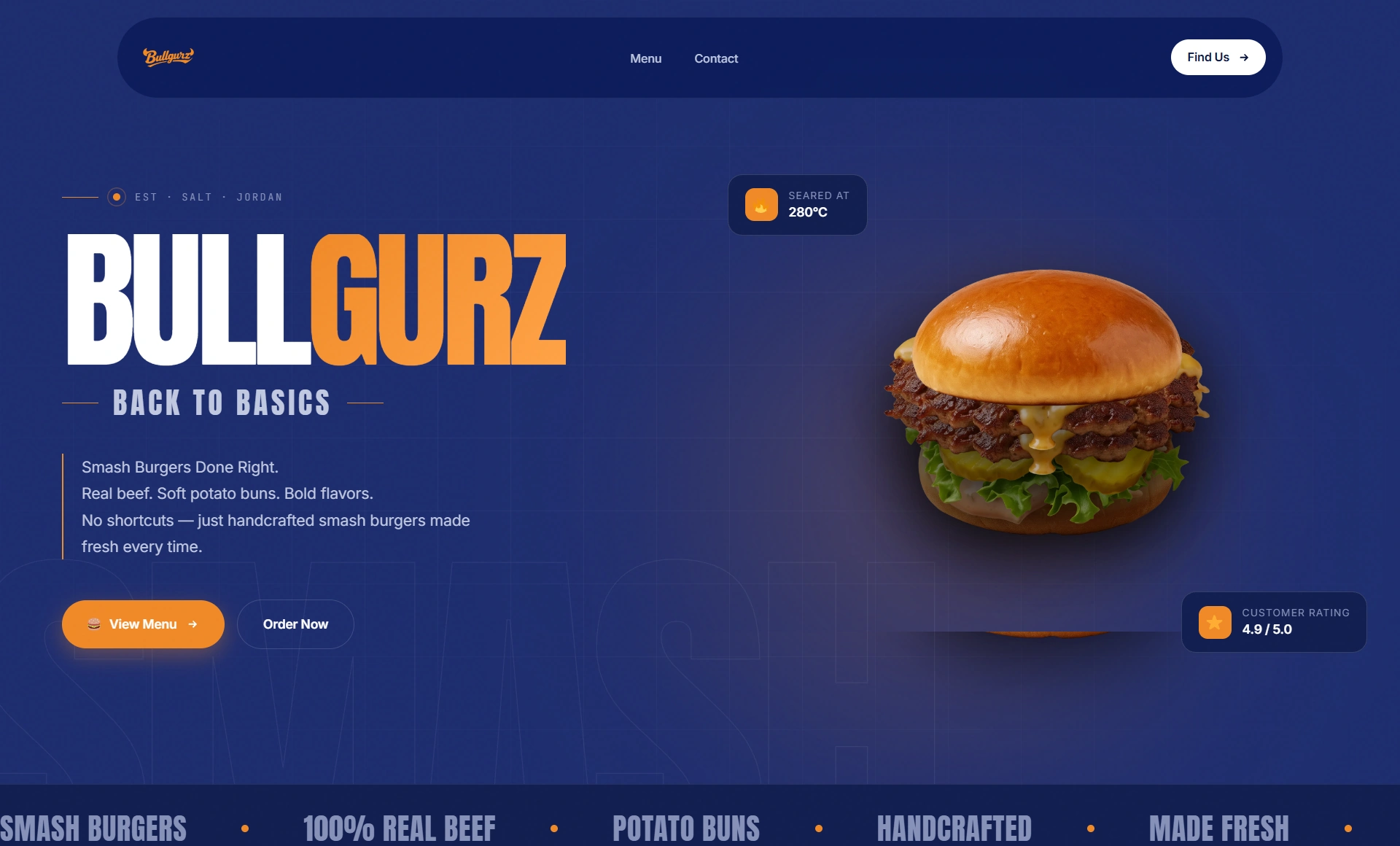
Project Story
The website needed to feel immediate, confident and memorable—without becoming a generic restaurant menu or a template-driven landing page.
Turn a visually loud burger identity into a website that stays easy to scan, keeps the food at the center, and creates a clear path from brand story to menu and inquiry.
Use strong scale, deep blue fields, orange action moments and oversized food imagery, then introduce a receipt-inspired contact experience as a memorable functional detail.
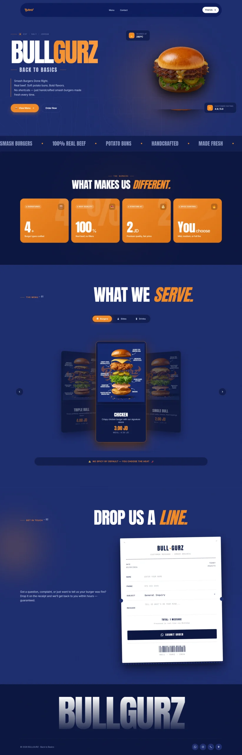
Full Website Reveal
The complete homepage moves from the brand statement to proof points, menu discovery, the receipt interaction and the final brand sign-off.
Design Process
The process focuses on translating a high-energy food brand into a digital system without losing clarity or appetite.
 Case Study / Project 02
Brand energy → content hierarchy → menu storytelling → signature interaction → WordPress build.
Identify the visual signals that make Bullgurz feel distinct: bold type, dark blue space, bright orange accents, direct language and appetite-led imagery.
Identity · Tone · Visual cuesReduce the experience to a simple narrative: what the brand is, why the product is different, what is served, and how users can take the next action.
Structure · Hierarchy · NavigationGive each burger enough visual weight to feel like a product moment rather than a conventional restaurant list, while preserving price and option clarity.
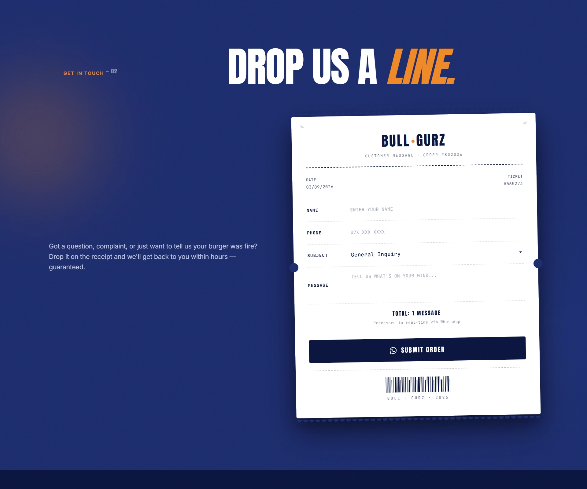
Product storytelling · Menu UITurn the contact moment into a receipt-inspired interface, connecting function directly to the physical language of ordering and fast food culture.
Concept · Interaction · MemorabilityUse scroll, scale and layered transitions to keep the long page energetic while protecting readability and giving the food imagery room to breathe.
Motion · Pace · EmphasisTranslate the direction into a responsive WordPress implementation and refine the visual details, section spacing and interaction behavior for launch.
Development · QA · PolishSelected Experience
Instead of small thumbnails, the key website moments are presented at a larger scale so the typography, pacing, product photography and interaction concepts stay visible.
An immediate statement that pairs the product with the brand’s strongest typography and color contrast.
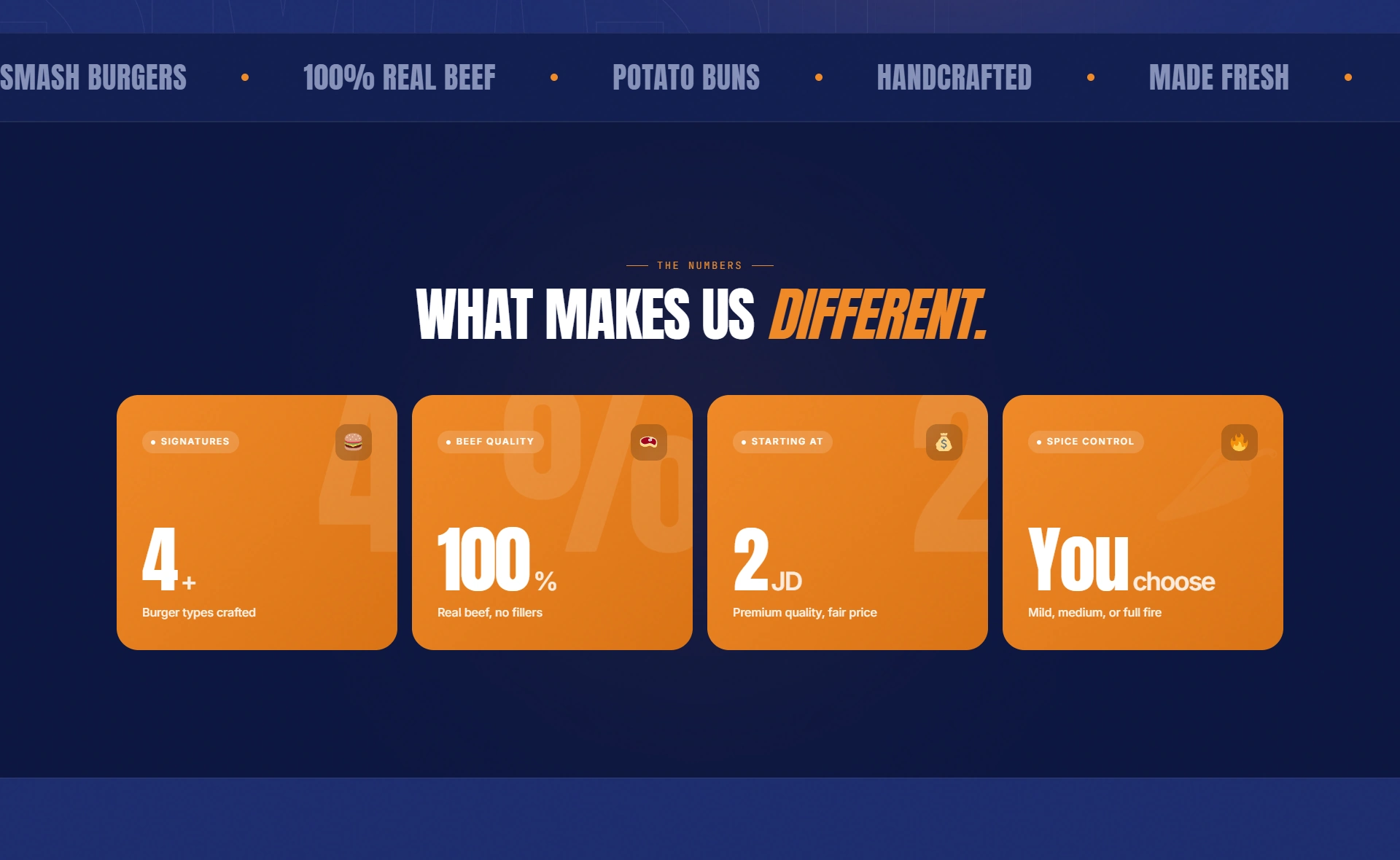
Key product signals are converted into bold proof points that can be understood at a glance.
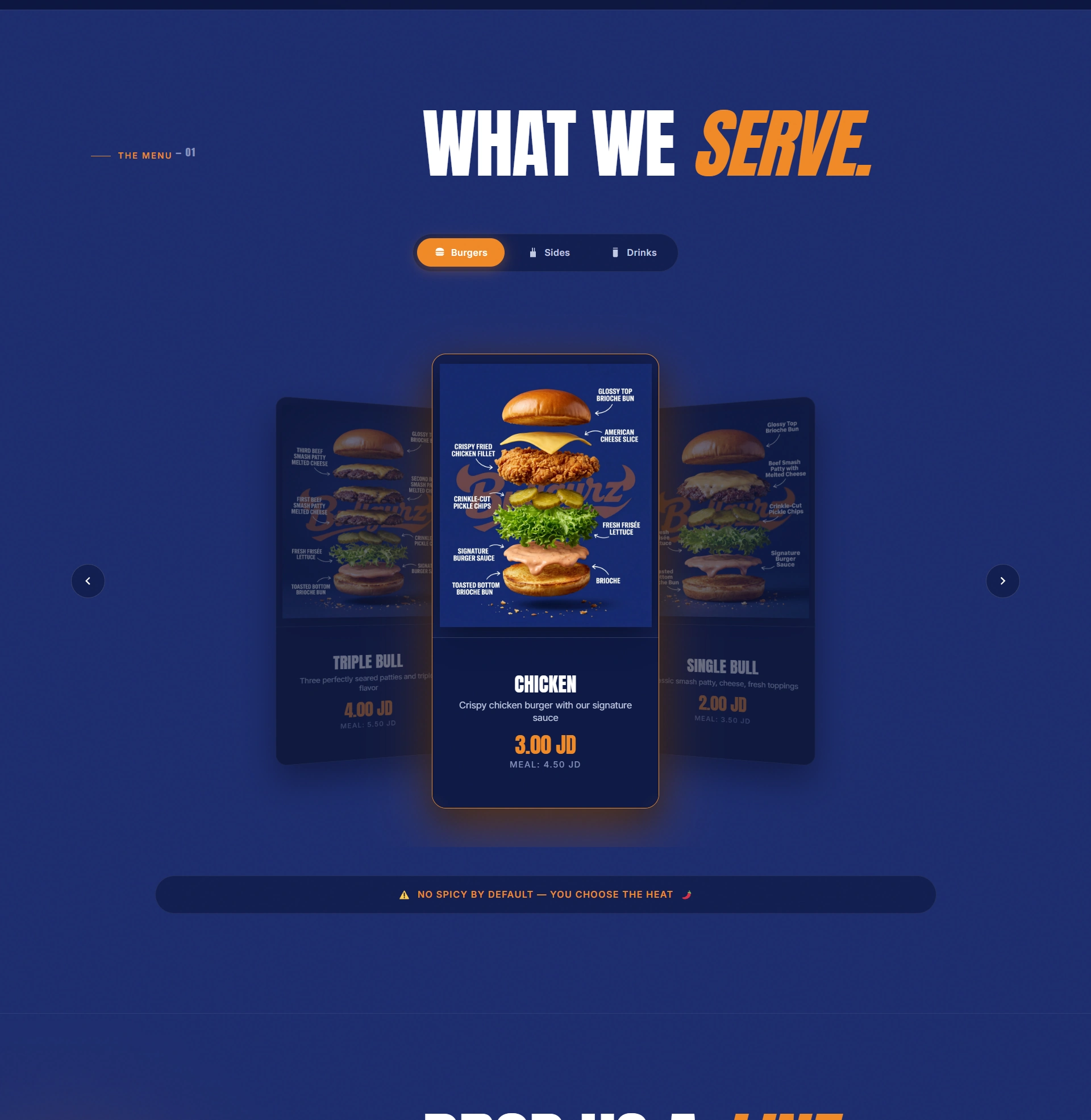
The product area uses scale and depth rather than a dense menu grid, keeping the experience focused on appetite.
A familiar physical object becomes the functional interface for the contact moment, giving the experience a memorable ending.
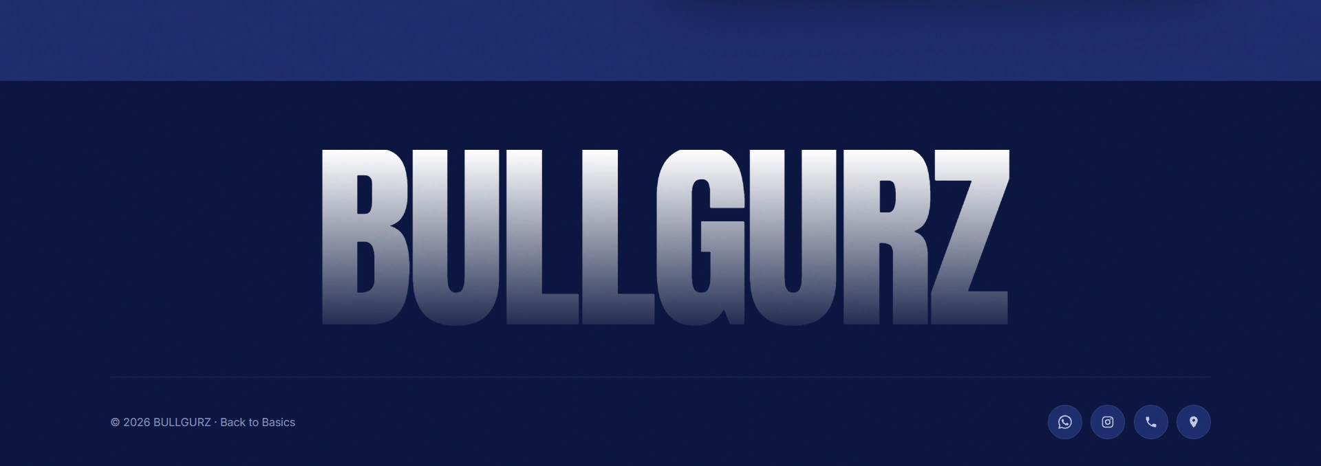
The final section carries the same visual rhythm through to the end, so the experience closes with intention instead of fading into a generic footer.
Signature Detail
The receipt treatment is more than decoration. It turns a routine form into a recognizable part of the Bullgurz experience and connects the website to the language of ordering, tickets and service.
Experience Highlights
Large type and color fields keep the experience unmistakably branded.
Food imagery remains the primary visual driver instead of becoming decoration.
Each section has one job, making a visually rich page easier to follow.
The receipt concept gives a functional moment its own identity.
Outcome
The result is a focused restaurant experience that keeps Bullgurz’s attitude intact while giving the brand, menu and signature ordering language a clear digital structure.